SaaS landing pages: Optimize + Examples
A SaaS landing page is a highly focused webpage designed to achieve a specific goal, whether that’s driving sign-ups, boosting subscriptions, promoting a webinar, or generating leads.
Unlike a homepage, which provides a broad overview of your company, a landing page is built for conversions, guiding visitors toward a clear action with minimal distractions.
For SaaS companies, SaaS landing pages have an average conversion rate of 9.5% and a median conversion rate of 3.0%. So optimizing is essential for maximizing conversions by presenting the right message to the right audience at the right time.
SaaS landing pages come in different forms, depending on their purpose:
• A pre-launch landing page helps build excitement for an upcoming product.
• A product landing page highlights key features and benefits, persuading visitors to sign up.
• A pricing page breaks down costs and emphasizes the value of your SaaS for purchase.
When done right, a well-optimized SaaS landing page guides potential customers through the buying journey, minimizes friction, and ultimately boosts your bottom line.
SaaS Landing Page Best Practices
The structure of a landing page varies based on its goal, but most include a hero section, call-to-action (CTA), features breakdown, multimedia elements, and additional resources.
• Focus on user needs – Define clear goals for your landing page and tailor content to match what users are looking for.
• Clarity over complexity – Keep your value proposition and CTA straightforward, avoiding jargon that might confuse visitors.
• Use visuals strategically – Incorporate engaging images, videos, and graphics to enhance the experience without distracting from your primary CTA.
• Leverage social proof – Showcase customer testimonials, reviews, case studies, and industry awards to build trust and demonstrate real-world value.
• Highlight real-world applications – Provide use cases and step-by-step guides to help users understand how your software fits their needs.
• Offer resources for easy learning – Include integration details, self-service tools, AI chatbots, and FAQs to support users in their decision-making.
• Optimize for conversions – Ensure your page is mobile-friendly, test different layouts, and use A/B testing to improve performance.

How to Optimize SaaS Landing Pages for Conversion
Optimizing SaaS landing pages for conversions requires a mix of compelling copy, trust signals, clear CTAs, and an intuitive design. Here’s a breakdown of how to maximize conversions:
1. Clear and Persuasive Headline
• The headline should instantly communicate the value of your product.
• It should be benefit-driven, not feature-focused.
• Example: Instead of “AI-powered CRM,” use “Close 3X More Deals with AI-Powered CRM.”
2. Strong Subheadline
• Reinforce the value proposition and address the user’s pain point.
• Example: “Automate follow-ups, personalize outreach, and never miss a lead again.”
3. Engaging Hero Section
• Include a compelling image or video that demonstrates your product’s use.
• A CTA (Call-to-Action) button should be above the fold.
4. Conversion-Optimized CTA
• Use clear, action-oriented language like:
• “Start Your Free Trial”
• “Get a Demo”
• “See It in Action”
• Avoid generic CTAs like “Learn More.”
• Make it contrasting in color and easy to spot.
5. Social Proof and Trust Signals
• Use logos of companies using your SaaS.
• Include testimonials, reviews, or video case studies.
• Add trust badges (e.g., “GDPR Compliant,” “Trusted by 1,000+ Companies”).
6. Address Pain Points with Benefits
• Instead of listing features, connect them to benefits.
• Example: Instead of “Automated Workflows,” say “Save 10+ hours per week with automated workflows.”
7. Reduce Friction
• If you have a signup form, keep it short (name + email is ideal).
• Offer a free trial with no credit card required to encourage sign-ups.
• Use live chat or a chatbot to answer common objections.
8. Clear, Scannable Content
• Use bullet points and short paragraphs for easy readability.
• Highlight key points in bold or with icons.
9. Fast Page Load Speed
• Optimize images and use a lightweight design to prevent slow loading.
• Check performance using Google PageSpeed Insights.
10. Mobile Optimization
• Ensure your page is fully responsive.
• Test forms and CTA buttons on mobile devices.
11. Exit-Intent Popups
• Offer a last-minute incentive when users try to leave (e.g., “Want a free consultation?”).
12. Personalized Content
• Use dynamic content based on visitor type (e.g., first-time visitors vs. returning users).
• If targeting multiple industries, tailor messaging accordingly.
13. FAQ Section
• Address common concerns like pricing, integrations, and security.
14. A/B Testing & Heatmaps
• Run A/B tests to compare headlines, CTAs, and layouts.
• Use heatmaps (e.g., Hotjar) to analyze where users click and drop off.

SaaS Landing Page Examples
Miro
Miro is a visual collaboration platform designed for innovation, where teams can manage projects, design products, and brainstorm.
Miro’s journey mapping solutions page
- Clean design: The landing page boasts a clean, uncluttered layout with ample white space, enhancing focus on important elements.
-

- Social proof: Page has scrolling logos and boasts impressive user numbers to strengthen its impact at scale.

-
- Effective copy: Utilizes short and impactful text targeting the customers pain points looking for this solution. Uses solution to showcase value of product beyond and the adjacent problems it solves.

-
- User experience reflection: The simplicity of the page mirrors the seamless user experience of using Miro itself.
-
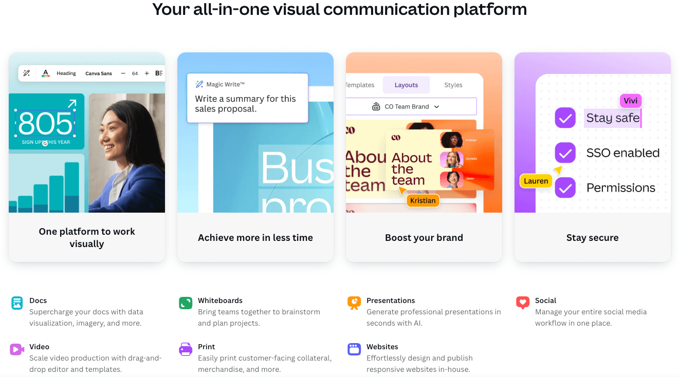
Canva
Canva is a global online visual communications platform on a mission to empower the world to design.
- Clean design: The page has a clean layout with good flow, but could include more specific product shots. They are more of a high level overview, not really targeting the enterprise use cases.

-
- Social proof: Heavy social proof referencing the large number of organizations using Canva and providing case studies from well known established companies.

-
- Effective copy: Copy provides an overview of the key benefits and use cases of Canva for enterprise whilst positioning the product as the all-in-one visual communication platform.
SaaS Landing Page FAQs
What are the types of SaaS landing pages?
- Product landing pages
- Click-through landing pages
- Lead capture landing pages
- Long-form sales landing pages
- Brand awareness landing pages
- Video landing pages
- Pre-launch landing pages
- Lead magnet landing pages
- Referral landing pages
- 404 landing pages
- Thank you landing pages
What is the success rate of landing pages?
Conversion rates vary depending on the type of landing page, for example a specific use case landing page converts at 15% vs the homepage at 4%.


